Allosure – Early Kidney Disease Testing

The following is a Conversion Rate Optimization analysis of a clients landing page. I identified potential issues and provided actionable recommendations to improve its performance. I’ve evaluated the design, layout and content, as well as the user experience and call-to-action placement. My analysis takes into account the latest conversion rate optimization techniques and best practices.

Task

CRO Analysis & Enhancement for CareDx Landing Page
  • Strategy

    Analyze heat map & website analytics

  • Design

    UI/UX Design, CRO

  • Client

    CareDX

  • Tools

    Figma, Unbounce, Hotjar, Google Analytics

Open Project
results

Boosting Engagement: An 18% Surge in Form Submissions

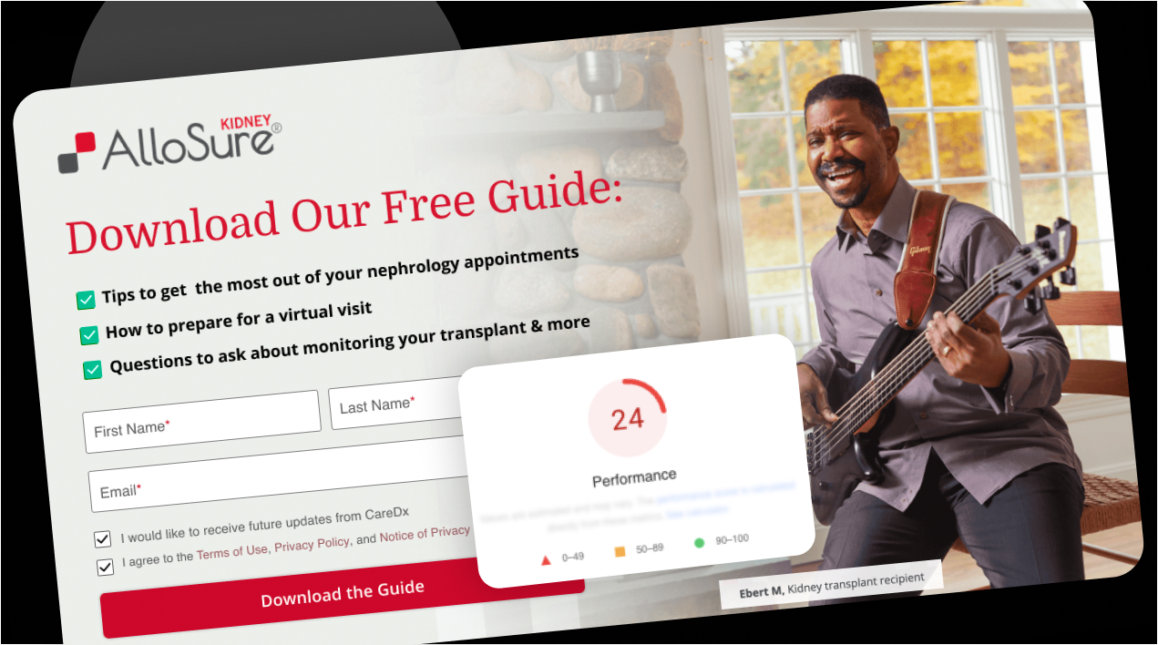
Following the implementation of targeted design adjustments, strategic placement of call-to-action buttons, and optimization for mobile users, we observed a notable 18% increase in form submissions. By refining the user experience across all devices and leveraging conversion rate optimization techniques, we significantly enhanced user engagement. This comprehensive approach not only improved the desktop experience but also made the mobile site more user-friendly, leading to a higher rate of potential customers engaging with the website and reaching out.

My Approach

Minor tweaks, major impact

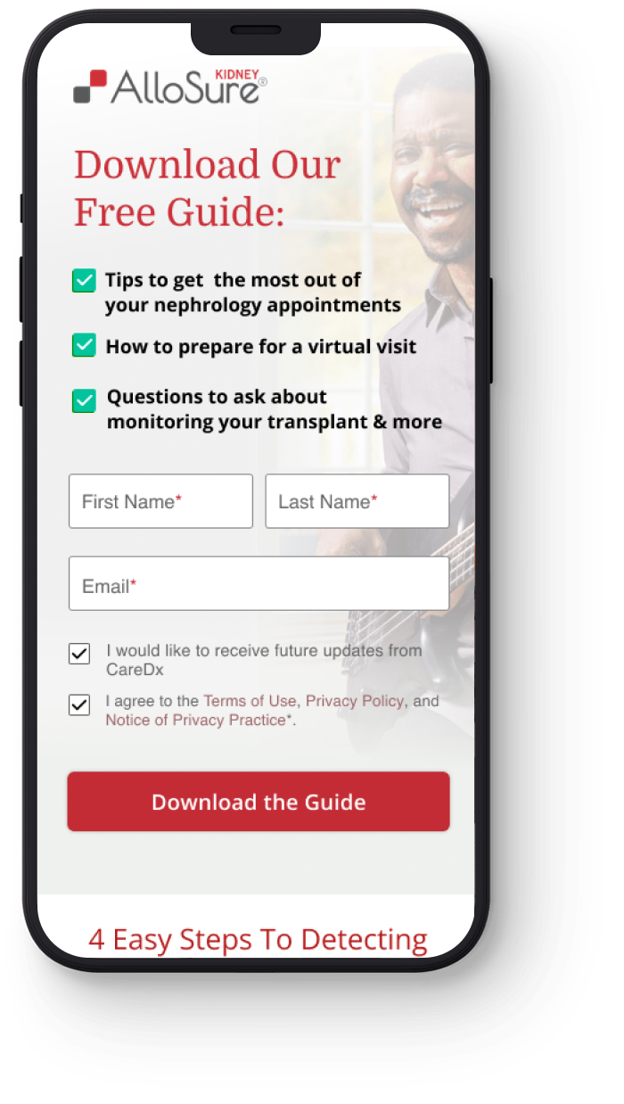
The before landing page had a top notice bar that took up a lot of ATF (above the fold) space on mobile and pushed the lead form submit button below the fold. The notice bar linked off to an  unrelated webinar. This is fine for website home pages, but not for landing pages.

I redesigned the mobile version of the landing page to ensure the entire lead form was above the fold, and the form was cleaned up to remove unecessary information.

Before
After
Above The Fold

Hero Section Comparison

Before After
desktop

Website Design

Mobile View

Mobile Website Design