CHSI Technologies – Insurance Management Platform

A SaaS platform in the Insurance Technology sector had a brand that was muddled in with the corporate brand. See how I went from a website redesign request to a complete rebrand.

Task

Execute a Website redesign while simultaneously conducting a full rebrand

  • Strategy

    Design & build a site that clearly communicates & simplifies the software benefits & features

  • Design

    Brand, UI/UX, Website

  • Client

    CHSI Technologies

Open Project
Challenge

Design an updated, modern web presence for at top InsurTech software company.

CHSI Technologies is a leading developer of cloud-based enterprise management systems for small insurance companies, the commercial, municipal and self-insurance markets. They have a relatively mid-low competitive market in the Insurance industry.


The SaaS platform that CHSI Technologies developed, CHSI Connections, had no stand alone branding and was muddled with the corporate brand. I was tasked with redesigning their website, but quickly realized what they really needed was complete brand overhaul and better definition of their product and offerings.


Keep reading to see how I productized their SaaS platform by designing a new brand & how I built a site that streamlined their offerings and developed consistent messaging.

my process

Evaluate project wants vs. business needs & goals

CHSI Tech asked for a new Website that: 

  1. Provides a clean, user-friendly, and engaging web presence.
  2. Offers relevant product information for up to six products with high quality images.
  3. Allows the user to quickly find and view and core products.
  4. Gives potential customers the means to easily contact CHSI Tech regarding products and have CHSI TECHNOLOGIES qualify them.
  5. Showcases core products to attract and convert customers.
  6. A Content management system that will allow CHSI Tech to easily manage content on the site.

What CHSI Technolgies also needs is:

  1. A modern brand makeover consisting of an updated and new logo, icon, typography and more to help better communicate the technology they offer.
  2. A fresh set of eyes to see how their brand, product and pricing appears to their target audience.
  3. Rewrite content and key market messaging to better resonate with & attract their target audience.
Target Audience

Identifying the Target Audience: A Strategic Approach

My approach begins with a deep dive into understanding the audience because it shapes every aspect of my marketing and design strategy. For the CHSI Technologies website, I focused on professionals within government, public entities, and the insurance industry, aged 30 to 60. They’re looking to move away from cumbersome spreadsheets to a more streamlined system for managing insurance claims data and generating reports.


This insight led me to ensure the website would empower users to:

  1. Easily identify the CHSI Technologies product that would meet their unique needs,
  2. Access advice and insights on optimizing product use across various applications,
  3. Find company contact details, specifications, and technical information without hassle.

Starting with a clear picture of the audience, allows me to design a website that’s not just a tool, but a solution for their specific needs & challenges.

checking out the competition

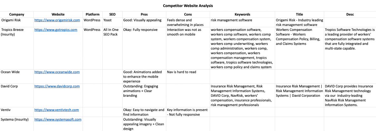
Competitor Website Analysis

Conducting a competitor analysis is part of my design process where I evaluate competitors’ companies, products, pricing, and marketing strategies. For this client I conducted a more basic analysis focusing on identifying the competition and evaluating their website only.

checking out the competition

Data-Driven Research

This confetti map is a visual representation that show the interaction of visitors on the clients old website. I use it to observe points for each click made by a visitor. In addition, each click has a color that represents a specific category within the different types of areas in which it can be classified.

Strategy

Proposed Solution

After meeting with the clients team and conducting preliminary research, I recommended the development of a completely new Website, built from the ground up with bold & clean graphic design elements to more quickly convey desired messaging and information with a design that speaks to the value and credibility that CHSI Connections can bring, just like any larger competitor.

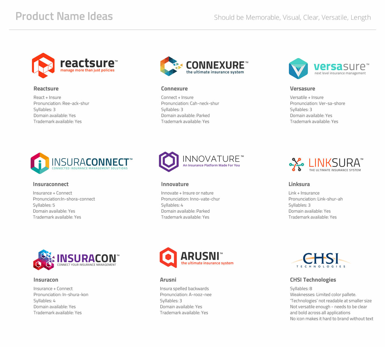
In addition to the new Website, I also pitched the need for a brand revamp that would encompass a new identity, logos, collateral, software UI, ads and more importantly separating their main flagship product from their Corporate brand to make it more clearer what their offering is. Below are some product names and logos I created that I used a visual aid to assist me in proposing they rebrand under their software/product name, CHSI Connections, and keep CHSI Technologies (their corporate company) separate.

Even though none of the new names were selected, it proved successful in that they agreed it made much more sense to rebrand under CHSI Connections, the actual product/software name.

For their new website, I identified the need to incorporate the following features:
  1. Google analytics performance reporting (none existed on their current site)
  2. Anti-spam features on contact forms
  3. Clean organic SEO markup to help get site indexed for the right keywords and search terms‍

This all plays an important role in making the whole look & feel of the CHSI Tech website experience.

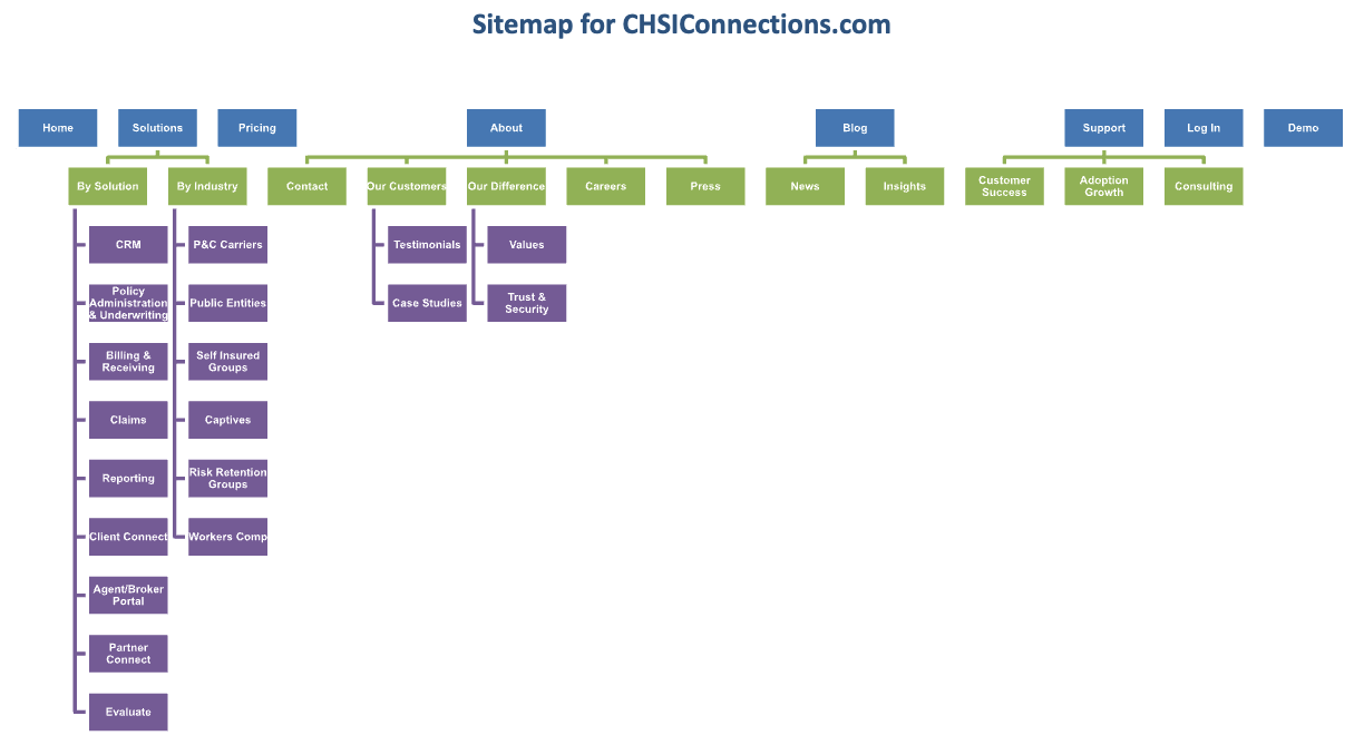
Information Architecture

For an SEO strategy, I wanted to have more content created to increase inbound marketing and encourage more organic traffic. Below was the preliminary structure I mapped for the site.

My approach

Execution

I designed and built a site that streamlined CHSI Connections new brand and developed consistent messaging and visuals to bring the platform and team’s story to life. The new site spotlights the many advantages of the platform in the form of new, simpler, easy to understand copy, stand-alone pages for specific features/solutions, and optimized titles and CTAs to establish topical authority.

I crafted a fresh, modern design, marrying white space with pops of color to catch the visitor’s eye and bring the softwares features and benefits to life.

Combining personalized touches with user-friendly navigation allowed me to speak directly to each of the client’s ideal customer personas.

I was responsible for all work shown including but not limited to logo design, corporate collateral creation, Website design and build and client communication.

Before After
Deliverables

Final Branding